Gone are the days when the office cafeteria was a drab, windowless room with humming vending machines and plastic folding chairs. In the high-stakes corporate world of 2026, the “breakroom” has been rebranded as the “Social Heart” of the office. It is no longer just a place to consume calories; it is a strategic tool designed to foster spontaneous collaboration, reduce burnout, and reinforce company culture.
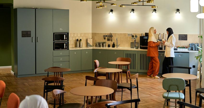
The interior design captured in the second image is a masterclass in this new wave of “Hospitality-First” workplace design. By blending residential comfort with commercial efficiency, this space offers a blueprint for the ultimate modern office pantry. Let’s explore the design elements that turn this cafeteria into a sanctuary for the modern professional.
1. The Psychology of Color: Sage and Earth Tones
The first thing that strikes the viewer is the sophisticated and calming color palette. The room is dominated by a deep Sage Green on the ceiling and cabinetry, balanced by warm whites and terracotta accents.
- The Green Ceiling: Traditionally, office ceilings are white or industrial grey. By painting the ceiling a muted sage green, the designer has lowered the “visual volume” of the room. This color is psychologically associated with nature and tranquility, helping employees physically decompress the moment they step away from their monitors.
- Sage Cabinetry: The matte finish of the sage-green cabinets provides a sleek, modern look that hides fingerprints and wear-and-tear better than high-gloss finishes. It creates a seamless “monolith” look that feels more like a high-end kitchen than a communal pantry.
2. Lighting: From Utility to Atmosphere
Lighting is the most powerful mood-setter in any interior. This cafeteria moves away from standard overhead panels and instead uses a “Layered Lighting” strategy.
- The Statement Chandeliers: The gold-accented, multi-arm chandeliers are the crown jewels of the room. They add a touch of “Mid-Century Modern” elegance, signaling to employees that this is a space for quality time, not just a quick pitstop.
- Warm Scones: Notice the individual wall sconces above the backsplash. This creates “task lighting” for the coffee station and food prep area, ensuring that the staff can see what they are doing without needing to flood the entire room with harsh light.
- Pendant Accents: In the foreground, frosted glass pendants provide soft, diffused light over the dining tables, mimicking the intimate atmosphere of a local bistro.
3. The “Third Place” Layout
Sociologists often refer to a “Third Place”—a social environment that isn’t home (the first place) and isn’t the desk (the second place). This cafeteria is designed to be that third place.
The Bistro Seating Arrangement
Unlike long, daunting communal benches, this space utilizes small, circular wooden tables.
- Flexibility: Circular tables allow for easier flow of movement and can be quickly pushed together for larger groups or kept separate for private conversations.
- Equality: A round table has no “head,” promoting a sense of flat hierarchy where a junior intern and a senior executive can share a coffee as equals.
- Contrast Seating: Notice the variety of chairs—some in dark wood, others in muted teal and terracotta. This subtle variety prevents the room from looking “mass-produced” and gives it a curated, residential feel.
4. Textural Sophistication: Parquet and Tile
The materials used in this cafeteria were chosen for their tactile appeal and longevity.
- Chevron Parquet Flooring: The light oak flooring laid in a chevron/herringbone pattern is a high-end architectural detail. It provides a warm, organic base for the room and guides the eye through the space, making the area feel longer and more expansive.
- Textured Backsplash: The cream-colored, square-tiled backsplash has a slightly irregular, “hand-made” texture. When the wall sconces hit these tiles, they create soft highlights and shadows, adding a layer of “human touch” to an otherwise clean-lined kitchen.
5. Seamless Integration of Technology
A modern cafeteria must be functional. This design hides the “heavy lifting” of a kitchen within beautiful cabinetry.
- The Appliance Niche: The microwaves are neatly recessed into the cabinetry at eye level. This prevents the “clutter” of appliances sitting on the counter, leaving more space for food prep and socializing.
- Professional Coffee Station: To the right, a high-end espresso machine is the focal point. Providing “Barista-quality” coffee is one of the highest-rated perks by modern employees, and placing it in a beautiful, well-lit corner encourages people to linger and chat while their drink brews.
6. How to Implement These Ideas in Your Office
You don’t need a multi-million dollar budget to upgrade your office pantry. You can achieve this “Bistro-Style” look with a few targeted changes:
The “Accent Ceiling” Hack
If your office has a standard drop-ceiling, consider painting the metal grids or replacing the white tiles with a colored or textured alternative. It immediately changes the acoustics and the mood of the room.
Upgrade the Hardware
One of the easiest ways to make a cafeteria look expensive is to swap out standard cabinet handles for brushed gold or matte black hardware. It’s a small detail that provides a massive “luxury” ROI.
Create “Nooks”
If you have a large, open cafeteria, use rugs or different lighting styles to create “zones.” Use soft seating for a “Lounge Zone” and small round tables for a “Focus/Chat Zone.”
7. The ROI of a Beautiful Breakroom
Why does any of this matter? In the age of remote work, the office must offer something the home office cannot: Connection.
A space like the one pictured encourages “The Watercooler Effect”—those unplanned meetings where a developer talks to a marketer, leading to a breakthrough idea. When employees feel that their company has invested in their comfort, their “Sense of Belonging” increases.
This cafeteria doesn’t just provide coffee; it provides a sense of value. It tells the team: “Your time away from the desk is just as important as your time at it.”
Final Thoughts
Designing an office cafeteria is about more than just choosing the right microwave. It is about understanding the human need for rest, beauty, and social interaction. By using a sophisticated palette of sage and gold, incorporating bistro-style seating, and prioritizing warm, layered lighting, you can transform a functional room into the soul of your company.
In 2026, the best offices won’t just be the ones with the fastest Wi-Fi; they will be the ones with the most inviting cafeterias.
What is the one thing your current office pantry is missing? Is it more greenery, better coffee, or perhaps a more “moody” color scheme like this sage green?