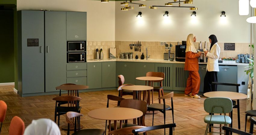
For decades, the office cafeteria was an afterthought—a utilitarian space of plastic trays, glaring fluorescent lights, and sterile surfaces. It was a place designed purely for the consumption of calories, not the cultivation of ideas. But as the nature of work has shifted toward hybrid models and a deeper focus on employee well-being, the “corporate canteen” is undergoing a radical metamorphosis.
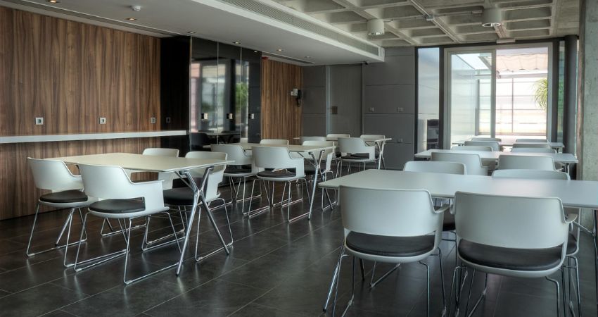
The office cafeteria featured in the image is a perfect embodiment of this new philosophy. It is a space that bridges the gap between industrial efficiency and residential warmth, proving that a cafeteria can be the most culturally significant room in an office building. Let’s dissect the elements of this sophisticated space and explore how you can translate this “corporate commons” aesthetic into your own workplace design.
1. The Power of Contrast: Industrial vs. Organic
The most immediate takeaway from this design is the successful balancing act between two distinct aesthetics: Industrial Minimalism and Warm Modernism.
- The Industrial Skeleton: The ceiling features a prominent, exposed waffle-slab concrete structure, which adds architectural texture and height. The grey tiled flooring provides a neutral, durable base that grounds the room.
- The Warm Softener: Against this hard, industrial canvas, the designers have introduced warm walnut-toned wooden wall paneling. This is a critical design choice. Without the wood, the room would feel cold and echoes-prone. The wood acts as a “thermal blanket” for the eyes, making the space feel approachable, cozy, and distinctly human.
2. Furniture: Functionality Without Formality
The furniture arrangement in the image challenges the traditional “cafeteria” layout. Instead of rows of bolted-down tables that resemble a school hall, the layout is flexible and purposeful.
- Lightweight Modernity: The white-shelled chairs with dark cushions are visually light, keeping the space from looking cluttered. Their slender metal legs maintain clear sightlines, which makes the room feel significantly larger than it is.
- Flexible Table Arrangements: The modular, rectangular tables allow for easy grouping. Whether you have a team of four or a large project group of twelve, the furniture can be reconfigured in minutes to suit the needs of the moment. This is a crucial element in modern office design: The space must be as agile as the teams working within it.
3. Lighting as a Strategic Tool
One of the most common failures in office cafeteria design is relying solely on overhead tube lighting. This space opts for a more sophisticated, multi-layered approach.
- Layering the Light: The designers have utilized recessed lighting within the waffle ceiling to ensure uniform ambient brightness. However, the white walls and large window panes bring in abundant natural light, which is the most important factor in keeping a cafeteria feeling fresh and inviting.
- The “Bistro” Effect: By keeping the design clean and uncluttered, the cafeteria mimics the look of a high-end bistro or a trendy urban cafe. This design language signals to employees that their lunch break is a time for relaxation, not an extension of the cubicle experience.
4. The Philosophy of the “Third Place.”
In urban sociology, a “third place” refers to a social environment separate from the two primary environments of home (the first place) and the office desk (the second place). The cafeteria pictured here is clearly striving to be that third place for the company.
- A Break from the Screen: The lack of technology integrated into the dining tables encourages face-to-face interaction. In a world where we spend 8+ hours a day behind monitors, the cafeteria serves as a vital “off-ramp” for the brain.
- The Value of View: The large floor-to-ceiling glass windows at the rear of the room provide a visual connection to the outside world. Integrating a view—or even just natural light—is a cornerstone of Biophilic Design. It allows employees to reset their internal clocks, reducing the afternoon “slump” that often hits in dimly lit, interior-focused offices.
5. How to Elevate Your Own Office Cafeteria
If you are looking to revitalize your corporate breakroom, you don’t necessarily need a full-scale renovation. You can implement the principles seen here in stages:
The “Wood Accent” Rule
If your cafeteria feels sterile, adding a single feature wall of wood paneling can change the entire frequency of the room. It adds warmth and texture without requiring complex construction. Use sustainable, pre-finished wood veneer panels for an easy installation.
Rethink Your Seating
Replace clunky, outdated cafeteria furniture with sleeker, thinner, and more ergonomic alternatives. Look for pieces that are easy to clean (like the white-shelled chairs in our image) but don’t look like they belong in a hospital.
Soften the Acoustics
The combination of concrete ceilings and tiled floors can create a noisy, echoing environment that is the enemy of relaxation. If your space is too loud, consider adding acoustic baffles between the ceiling beams or installing sound-absorbing fabric art on the walls. This will allow for genuine, easy conversation during lunch.
6. The Culture of “The Commons”
The true success of a cafeteria design isn’t found in the materials, but in the behaviors it fosters. When a company invests in a beautiful, high-quality dining space, they are sending a message to its workforce: Your well-being matters. Your collaboration with your peers matters. Your time away from your desk is valuable.
In an era where remote and hybrid work is the norm, the office has to work harder to “earn the commute.” Employees are less likely to come into the office to sit at a desk they could use at home. However, they will come in for the culture, the spontaneous meetings, and the shared coffee breaks. A well-designed cafeteria—a place for the “Corporate Commons”—is the strongest magnet you have for building a community.
Final Thoughts: Designing for the Human Experience
We often speak of office design in terms of efficiency, layout, and capacity. But as the image shows, the most effective spaces are those that prioritize the human experience. By balancing the industrial with the warm, the functional with the beautiful, and the structured with the flexible, you can turn a basic cafeteria into a space that fuels creativity and strengthens company culture.
Whether you are a facility manager or an employee with an eye for design, the lesson is clear: if you design a space that respects the human need for light, comfort, and social interaction, the productivity will naturally follow.